the StarOnion onto Version 3!
Posted in Arts, Dats and 3ds, Final Fantasy XI on October 20, 2007  Email this post
 Print This Post
the StarOnion’s New Faceplate!

Maiev’s very first blog! Version 1
It took quite awhile to get this thing sort of working. I guess its working ^^; but yea, I hope this is more eye pleasing, easier to both use and navigate! I pretty much totally annoy Daggy to draw the whole banner hehe, so something more relaxing to look at!
If you are kinda lost, I don’t blame you ‘.’, not really good with designing easy to use stuff! Well anyway, here’s a little post just to take you through what’s really changed and where stuff are!
For those that haven’t been following my blog, this is like the 4th revision of the layout. My last 3 was… Um…
Version 1
I pretty much pick something… anything… and just get started hehe! I was just too excited about writing one (well… kinda had nothing to do after HNMLS-less xD)… its like holding on to your piss.. its hard!
Not the most brilliant coding either, I kinda turned it into MySpace :/ But hay! I was a newbie though ‘.’ Whatever.. clicks wasn’t amazing but meh…

Maiev’s Blog Version 2!
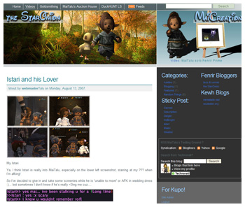
Version 2
So after looking at some more people’s blog, or even my neighbors (eg. Jowah, Strawberrie), I was kinda “underdressed”, so upgraded to that theme! This was um… around October.. I remember cuz I was procrastinating from studying :)
That period, I just didn’t want to study, so just went to personalize it… was trying to fit youtube in but meh.. didn’t look nice. The source of this theme only had like 6 files xD, so I got a chance to really understand how WordPress works as a whole!
Then comes… more demand in sleek and… simplicity! I had a white one, but decided to stick with blue in the end. I just love the color blue!

Maiev’s Blog! A few hours ago!
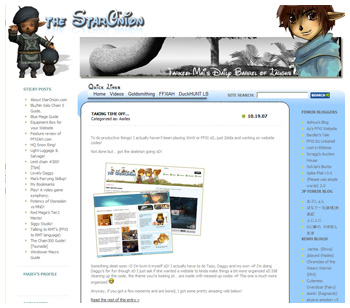
Version 3
I’ve stuck with this theme for awhile cuz I kinda prefer something simple… at least during that time. Not extremely simple but also something easier and friendly to load. Another reason was due to traffic… thanks to Scragg =P kinda promoted it a lot! Some came from Google search so having better codes was kinda the motivation to make that one. In the end.. its kinda full of trash… You just don’t see it but oh man… its horrible…under the table ^^
Some old posts aren’t tuned for the new formatting, I’ll try to work my way back to post that most people come in for (such as Parrying hehe) and just for entertainment, I’ve came by this really nice YouTube clip, someone re-edit the apple ads with new clips.. pretty amazing. Go watch it here.
So yea, I hope these codes are nicer for everyone’s browser, easier to use and of course, nicer looking =P Let me know what you think about this one ^^
4 Responses to “the StarOnion onto Version 3!”
Trackbacks/Pingbacks
Leave a Reply

Looks good- I like it a lot!
Yay! At least one person liked it ^^
I would like it, if it worked. GOD! GOSHHHHHHHHHHHHHH! jk :p
you are never a bother XD *hugs maimaipoops* Your like my best tarutaru buddeh! Also farkee-farkster XD hahaha, I love all designs you have done, If only I was creative with web designs XD and all those sorts of html codings!! Or at least with dream weaver…*shrugs* XD haha! Still, way better then I am :3 keep it up and I am always here to help you! well, when im alive in msn! LOL XD